I have been working on my Digipak and magazine add as I thought I could improve on them. So I kept them pretty much the same however have made on change which made a big difference.
 This is my second draft as you can see I have change the back image, in this I have added two of the same image however put them in different angles and placed them on each side. I think that it makes the inside look better and makes it look different and unique.
This is my first draft when the image as the back is one and is over the whole double page. I think this looks more clear as it the image is seen more clearly. making the image looks more noticeable.

This is my second version I think this one is Better however I may have not git the write text I need, the only way in which I can find this out is to get some audience feed back.

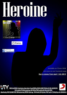
For my magazine advert I have the same background image however I am unsure about what should be on it there for I have to versions. The fist version is where I have used the front cover of the Digipak, with text.

This is my second version I think this one is Better however I may have not git the write text I need, the only way in which I can find this out is to get some audience feed back.

