Monday, 11 March 2013

Question 1

 Evaluation: Question 1


1. In what ways does your media product use, develop or challenge the forms and conventions of real media products?
Music videos are produced for both promotional and commercially this is because it is going to the new direction of Bollywood. I have challenged the code and conventions of most Bollywood films through mainly the music video and the CD cover. I did this as I felt that the western culture of music videos could be merged together to create music video to promote an artist and an album. The music video and album cover is the strongest way the public will view their persona, so the decisions made during these production processes are essential therefore I had to make these the most effective so people the public and my target audience would accept the music video and album and encourage this type of music come in to the industry of Bollywood.  Music videos for Bollywood will usually feature a main actress or actor along with dancers and other music videos have the actors/actresses singing to the camera. However I chose to challenge this particular feature of music videos by using a small narrative surrounding my dancing and music.   
                            
My music video begins with the showing the main character and her journey going somewhere. As an audience we follows the girl and making her way to an unknown place independently, at the end of the music video the audience see’s a text that comes up on her phone asking her where she is because she’s late for dance class.
            
My music video has a unique structure especially when comparing them to Bollywood music video, my music video starts with a girl looking up at a building in which she walks into and started to make her way to a place that remains unknown till the end. While she is walking cuts of dancers and performs are shown, the audience at this point are quite confused on what’s happening however because of all the effects and cross cuts it keeps the audience turned into watching the whole music video. in most Bollywood music  video it is very clear what’s happening from start to finish, therefore I have challenged this aspect of common Bollywood music videos.
I have tried to challenge the codes and conventions of the typical Bollywood music video by have an extended metaphor running through the music video. As the girl is walking literally she is in actual fact just walking however on a deeper note, she is making a journey to reach her goal which we as an audience find out at the end when the she receives a text form her fellow peer telling her she is late for dance class. The colour contrast makes this extended metaphor have more meaning, the black and white clips of the dancer’s shows what she wants to do and that are where she’s going and the reality is that she is making her way to achieve her goal, therefore the colour sequences of the girl is in colour as she in reality is making her way there and making her way to her goal which is to go to dance and become a dancer just like those who are shown in the black and white sequences.
                
I have also interpreted the song with the extended metaphor; the lyrics are in Hindi however the translation is basically ‘I’m falling in love with you, even though its rough and hard work I’m still in love with you. This can be seen as falling in love with dance and the girl may have a rough time to achieving her goals however because she’s doing something she really loves she will achieve her goal in the end. Therefore when accompanied with the video, her making her journey is a way for her to do what she loves and for her to start achieving her goal which is to dance.
The song creates a theme of inspiration and determination however is seen in between the lines, from the moment the girl looks up at the building it shows that she aims high and aim to achieve what she wants in this case where she wants to go. The girl walks towards the camera which makes the audience feel involved as they feel as if they are looking at the girl. There is also anticipation shows as the audience is only able to see her walking and making her way to the unknown which is revealed at the end of the video. To really enhance this by having slow paced cuts between her and the dancing until the end of the song where she’s gets a text form a peer saying ‘she’s late for dance’ this shows the audience that she making her way to achieve her goal by going to dance where she can practice and can become a professional dancer one day. Therefore the audience understands the concept of the video and understands she was walking towards her goal which is dancing at the end of the video which challenges other Bollywood music videos, as this concept isn’t common.  

Through the way I have I edited the music video it shows that the girl is going somewhere but we as an audience don’t know till the end which keeps the audience to keep watching to find out where she’s going? This created a cliff hanging approach; also it will engage the audience and challenges the norms of Bollywood
In Bollywood most songs are in a film therefore the song has some importance to the film, through the music video the album is promoted as well as the film. Another way I challenged this idea and made a music video which isn’t a part of a film and made an album in which is just music without film. This is different and a risky however, as it isn’t done much this could open doors for the futures of the music industry in the east and therefore more businesses will want to do this, and it will also engage more people which mean there is more ways for the industry to gain profits. So the music video and CD album works together to promote each other. Therefore I have done my best keep a sense of continuity between the products. Such as the colour scheme is Black and white on the album which is the colour I used in my video to show the girl achieving her goal of performing/ dancing where in black and white is her dream and the colour is reality.
 
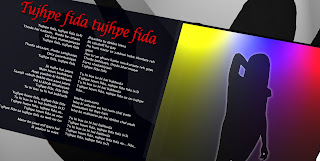
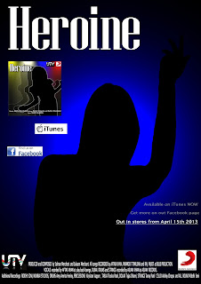
In my digipack and magazine advert designs, I used the conventions I have become both western and eastern products in the market. For example, I have used a simple but effect image of a stereo and by using lighting effect I have been able to make the stereo stand out and make it look more appealing. For the inside I have used the same technique however I used one image of a girl made her complete black as if it were a silwet and shadowed, to make it creative I used different coloured stocks on her to make it stand out. On the side I have the main song title with the lyrics by having a simple by professional look. to make it seen more performance based and dance style I used different coloured stocks and text which match a professional but dance style feel. The back of the CD cover is simple and with the main focus being the track list. By having a small image in the corner and the track list covering up to 2/3 of the space it’s the main attraction. With the recoding information at the bottom it looked professional and a high quality work. For my magazine advertisement I kept it very simple and effect therefore keeping a continued theme. I has the title of the album exactly how it was on the CD cover next to it I featured which will involve the buyer and the audience as they can scan the barcode with their mobile phone which is a link on the website of the film where they can find wallpapers, downloads, a link to follow them on twitter and Facebook. Under that was the same image I used in the inside of my CD album. I thought it was affect to keep the same images, colour scheme and theme the same as it is a professional yet cool look therefore more people would buy it and be more attracted to it. 

Sunday, 10 March 2013

Question 2


How effective is the combination of your main and ancillary texts?

The music video, magazine advertisement and digipack all work together to promote the album - ABCD, the advertisements are all encourages sales of the CD which can result to gaining profit through a business perspective. However if more CD’s are sold this can also be good commercially as it shows that the target audience and most importantly the public are liking the music from the album which they could have found out about through either the magazine advert and or the music video therefore each aspect that I have created work together to promote the album. As I have made a Bollywood theme each product that I have produced will also help promote the film which these song and music video is a part of therefore the products help to promote the film as well.

As well as the production company logo which is very important as they are also the music labels, a scanning barcode address is also included on the magazine cover which is a link to the website of the album - ABCD where the public can find out information about different all the different artists who feature in the album. The website will also allow the public watch the music video and download wallpapers and the album the website will also have links to each artists Facebook page and twitter accounts to follow their favourite artists. This is effective because it will get the attention of the public and will allow them to get involved therefore promoting the album which means that people are knowing more about it therefore buying the album and going to see the film.

The music video helps to promote the CD and the film, by firstly fulfilling the main purpose of entertaining and engaging the audience and then hopefully encouraging them to want to listen to the song regularly therefore buying the CD. Once the digipack is purchased the audience may take advantage of exclusive features provided to them, such as following the website links and entering interactional areas of the website which enable them to feel part of the film and have a relate to the character shown making her journey to what she wants in life.

I think that my media products work together well together, as they all show continuity regarding the design/stylistic choices. I used the same for the title of the album name which ABCD which is the logo on each product, which allows the audiences and public become more aware of the album and the film just be seeing the logo. It was important that I keep the continuity through each product this is because the music video and the digipack is a part of a film promotions therefore all three products most importantly work together to promote each other and more importantly they all work together to promote the film – Any Body Can Dance. As there is consistent continuity I feel this has a very effective, the fact they all have the logo in them will make the audience more aware of the album, therefore produce more people wanting to know about it so they may buy the CD or go online to find out of bit.


Wednesday, 6 March 2013

Question 3


3.what have you learned from your audience feedback

3. What have you learned from your audience feedback?

In order to create a successful product for my A2 media studies course work I produced a  music video-which was made to accompany the song ‘tujhpe fida’ from the Bollywood film  Heroine, it was important for myself and producers generally to consider the targeted audience before beginning the task. I considered in detail their age, gender, general interests, social class etc. I decided to aim my music video at the female gender, aged from 14-25 years old, particularly those interested in the Bollywood and dancing. I had to create a music video, digipack and magazine advert which appealed to this audience, so in order to understand and appeal successfully, I began studying similar products. I looked at the current magazine advertisements contained in Bollywood magazines and websites. I found that the magazine advertisements in these magazines generally seemed to be with main image the titles and the release date. Therefore following the codes and conventions I used the image from my digipack (CD cover), the title and scanning code to allow my audience and other reader to get involved and be able to very quickly have access to the website which on there would have lots of information and access to other attractions such as facebook and twitter  etc.

Gaining audience feedback has been vital in my project, enabling me to see what problems which I could then avoid which would slow me down with my work. I asked my friends and class mates to highlight the things that they liked about my work so far, but also the things that I could improved on. This was helpful as I could see what I was doing well on and what I need to focus more on. The feedback I received helped me in my work to make it much better therefore helping me to get a good finishing product. Specifically highlighted areas was the music video, and the problems I had was the concept, due to circumstances I had many problems which rose which were very unexpected and weren’t planned. I had to keep changing my idea slightly which meant that I had to keep story boarding or simply telling peers about my idea, and with that feed back I was able to improve my idea which them lead me to create my final music video and therefore helping me to get better each time to finally creating something I thought was a perfectly good idea.
The audience feedback was helpful in encouraging me to consider everything whilst planning, I think that my feedback helped me to see what I was doing well on but it’s the idea itself that needs double checking.

My music video would fall under the entertaining category, due to its pleasurable, pleasing appearance and use of interesting mise en scene, however while entertaining people it would also inspire them at the same time. It may also be regarded to Personal identity through the use of an influential female character that might inspire audiences. My magazine advertisement, digipack and music video has aspects which the audience can relate to such as clothing which regular people wear, and everyday look which har and make up, this therefore relates to personal identity again by encouraging the audience to become inspired and influenced.

When audiences see’s the advertisement in magazines, or the purchase the CD I intended for them to enjoy it but also feel as though they are cool yet smart, exclusivity almost which is something younger audiences typically crave.

The age of my intended audience begins around late teens towards adults, which is typically an age of self-discovery but ultimately a time when they begin to explore different sources of inspiration through the people they see in magazines and the music they listen to-so in this sense the target audience in regards to age particularly is suitable to the magazine. The social class I aimed my products at was C1-E, because the majority of young people are either students, apprentices or new workers, meaning there’s a high chance of them owning/having access to the internet where they can watch my music video and encourage them to buy the CD and recognise the artists in magazine advertisements which include the website address.

Stuart Hall’s reception theory focuses upon how audiences consume media, arguing that producers encode meaning into a media text for audiences to loosen. I included this in my media video by metaphorically representing of inspiration. For example the theme of
Inspiration and seeking for your goal is evident through the use of colour. the black and white sections of the music video shows the audience the girls dream is to dance contrasting with the coloured sequence which show the reality of the girl making her way to her dream. Therefore the ending of the music video is in black and white as it shows the audience she has made her dream and therefore is black and white. The girl in my music video is wearing very normal everyday clothing and make up representing regular people just like my audience. she wears dance style clothes as well for example the shoes  are look like what hip-hop dancers wear which highlights she wants to be a dancer.

I think that my music video and the accompanying products successfully appeal to my target audience which I selected pre-production. I think that my music video would not only be perceived as interesting, but also easily understood by the target audience due to the research, planning and feedback.

Question 4


When I began the task I used the internet to do all my research about music videos, this involved me researching on the history of music videos, music labels, what digipack+ looks like and their importance, different music directors and channels and etc. this is important because it help me understand how music videos are created, distributed and how music videos reach an audience.

After I had done all my research I started planning my music video, I used simple Olympics camera to take pictures of the sketched and story bored that I had made to me me with a rough idea of what I wanted the final products to look like. I could them pass this onto my blog, peers and people in my audience bracket and receive feedback on.

When I began learning how to use the media equipment I went out and tried using the DSLR Canon EOS 500d, to help me keep the camera steady I also used a steadicam. I shot some short clips and learnt the purpose of all the buttons, how to zoom in, how to take images/videos and then I loaded this onto a computer which I had a look at. After this I used a different lens which was a manual 1.8 focus lens, I need to learn how to use this lens therefore I need some practice. I used this lens while I shooting my real music video along with a slandered lens as it gave my footage more depth, also I was able to blur out the background which allows me to get a dancer in complete focus therefore adding more depth to my music video.


Once I’d reviewed the footage I used Window Movie maker where I made put all like clips I had shot together and added effects such as black and white and the speed (slow-motion). Following this I felt more comfortable with using the camera and more prepared for shooting the main task.

For my first draft of my digipack I has taken pictures with the the DSLR Canon EOS 500d at the location of where I was filming. Once the images were taken I opened them onto photo shop and adjusted the preset sizes so it was suitable for a digipack used different layers with different effect I made the images look like a pop art image. However I felt that this look didn’t match my music video so I changed change the whole lay out.
I using images from my As coursework for my digipack, I used PhotoShop to add effects such as blacking out the images and using the stroke tool to add different colours to each image. With the main image in the insider of my CD cover I fel one image look a little boring so while I was experimenting I found that the shadow looked quite nice and look quite professional. I did this by using copies of the image the using the filter on each of the image so the image fades back, for example on the first image I kept the filter as 100% the when down to 75% then 50% and finally 25%.  I also used the effects tool to add a slight gradient on the background, I felt it would give the pages more depth and look more professional and high quality.

I had to add in text for the CD cover name and track list seen on the back cover and the title/information seen on the magazine advertisement using the text tool. Photoshop enabled me to change the colour, size and font style of this text according to its importance and purpose. I thought I would keep have continuity between all the CD cover and the magazine advertisement. I did this by using the same colour scheme even with my music video and the same text size and font.

Whilst creating the music video I placed the camera onto a steadicam in order to create a polished finish which looked professional, minus the hand-shaking which is often inevitable from hand-held camera work. I adjusted the focus switching back and forth to create a blurred effect when the image of the candles first appears, then I turned the lens so that the focus became clearer as the music began. I was shooting dancers I filmed while they were practicing and learning the dance, therefore while shooting the camera had picked on the surrounding sounds such as the music which the dancers where dancing to, conversation which happening while the dancers where in action etc. due to this is I hand used an unlink tool which separated the visual video and the sounds, then I deleted the sound off the clip and placed the video above the sound track I was using.

I used Abode Premier Pro CS6 to construct my real music video together, to import files such as the clips I had shot and my music I would use a simple drag and drop method. I had to use the slice tool to chop some bits of the music video out which didn’t need to be. I shot my music video from different angles and settings- for example when the actress is walking I used different angles such as a close up, long shot, low angles, eye length angles - I felt that this type of frame created a versatility which surprised the audience and kept them interested. When my model is walking I have shots of her from the back, front and the sides in the begin of my music video it shows the a range of different angles with each shot, for example there is long shot of a building which she will be going into, then cuts to a lawn angles shot of the actress from the side, this showed she’s looking up at the building however it also shows that the girl is aiming high hence the reason for the low angle.


I changed the colour of my dancers by clicking on the video effects, and draging the black and white tool over to each clip which I wanted to be in black and white, for example during my music video when the actress is in the film the visual is in full colours then cuts to the dancers, the dancers are in black and white, I did this because it created a new dimension to the video, the black and white dancers contrast to the actress walking. the reason for this is show at the end of the video and there video black out a spot light is shown and the girl comes in to the sport light in colour and gets in to her first position, this again is in colour, this shows the girl is aiming to dance on stage in a spotlight therefore having dancers is what she does and is her past and this point is made more clear as she is continuously like waling to somewhere, which is in a metaphor for her journey to her aim which she achieved at the end of the music video.
On some of the clips between the dancer and the actress I have change the duration and the speed. I did this by used the seep and duration tool, I was able to add emphasis in moves of certain area so it looks effective and make the audience feel more engaged with the music video. To enhance the emphasis I use the tool which allowed me to position the clip on the screen for example make in to bigger or smaller or moving it left or right. I used this many time to enhance what is being seen therefore entertaining the audience to make them keep watching. The main place I used this was at the end when the I shot the section of the text coming up on the phone, this was because I had to make sure that the text was seen as clear as possible for the audience to know where she was going.

Monday, 4 March 2013

Sunday, 3 March 2013

Production log

Okay it the final week before my deadline, im really struggling on my music video, these last 10 seconds is all i need however do that I have to arrange of me to use my the stage in my school however there is a school production coming up and therefore rehearsals for that are not allowing me  to use the stage.
Digipack is all done, and all i need is just for my audience to give me feed back
evaluations: 3 out of 4 have been typed up. i will be typing up the last one ASAP then using different formats i will be posting them on my blog. for each question i will be useing a different format which will be, video, prezi, document and power point. this i know i can complete by the next monday which is the 11/03.

Friday, 1 March 2013

Production log

So I came to terms with my Digipack (CD cover) that it just wants right and looked very unprofessional and very tatty therefore wouldn't let me score as much as I could, therefore I had to improve all my print products as I need every mark possible with would help me when I take my exam

production log


so i have completeled my music video, the ending of her going up on stage and perforem has been scrapped i was upnable to use the stage in my school and i hae no where else to film. Thereofre i quickly came ip with an new ending which is the girl getting text from a peer saying ‘ dance class is started’ and then the girl walks through a door. This was the only way which i could tell the audience shes going to dance class and i still keep that realtly read image which the blakc and white and colour. 

Thursday, 28 February 2013

Production Log


This is a video production log of what I did today please watch it had a lot of important facts that I have found from my AUDIENCE!

Thursday, 14 February 2013

production log

So after a lot of stress and filming I finally have started editing my music video and have actually gotten somewhere with it. I finally have footage for the whole song which a narrative which will help me in my exam, I have added some effects such as speed, reverse  zoom, fade in and it and black and white. here is the first edit that I have done. Some clips are missing however I will be fixing that soon...
so here it is....
http://www.youtube.com/watch?v=WBOxxJDWXXM&feature=youtu.be

Thursday, 7 February 2013

production log

So I realised that my print products were okay however last night I thought it could be much better and therefore created a whole new digipack. The main reason for this was because I felt like my digipack was very classy and elegant however because of my music video changing I to a more fun rather than serious video I felt I should change my digipack. So with the image I took I manipulated them all and created this…

Production Log

due to my audience feed back i got told that my front page of my digipak was to dark and a bit too black, so tody i started experimenting with what i could do. so i insted of changing the image its self i deicied to add some lighing to and i managered to make my album cover more lighter by adding different coloured lights to it to make it better.

BEFORE:

AFTER:

Monday, 4 February 2013

Anamatic

this is a animated version of my story bored, I think this will help me in what I need to do and what I else that I have to film. This will also help me in timing my music video which will help be more organised with my work. I think this has helped me a LOT and now I know what I need to focus on.

this video is slightly slow so the music and the visuals are not synced together however it give you a good idea of what will happen in the music video.

Magazine advert

As i change the whole of my digipak i also had to change my magazne. With the opsotmer I ahd made beforehand i through i could used that in my magazine advert. my magaizne advert is quite simple however becuase of the poster in the background it makes it look quite busy and eye catching. i have also added a bar code for peopel to scan with their phones,  i thought this was a good idea as it enables my audeice to get invovled. this would also help with advertising as the bar code will go striaght to the ABCD website.
this would help promot not only the music video but also the actaul film, this is becuase in bollywood the norm is that music video is a part of a film.

Wednesday, 23 January 2013

Digipak and Magazine Advert

I have been working on my Digipak and magazine add as I thought I could improve on them. So I kept them pretty much the same however have made on change which made a big difference.  


This is my second draft as you can see I have change the back image, in this I have added two of the same image however put them in different angles and placed them on each side. I think that it makes the inside look better and makes it look different and unique. 


This is my first draft when the image as the back is one and is over the whole double page. I think this looks more clear as it the image is seen more clearly. making the image looks more noticeable.


For my magazine advert I have the same background image however I am unsure about what should be on it there for I have to versions. The fist version is where I have used the front cover of the Digipak, with text.


This is my second version  I think this one is Better however I may have not git the write text I need, the only way in which I can find this out is to get some audience feed back. 

Tuesday, 22 January 2013

Production Log

So the plan for this week is to finish my music vieo by friday, i need to also start my evaulation. For my evaluation i will write up a report for all four questions. one i have writen them all up i will think of creative ways to view my answe to each question. I am thinking about making a video for the the forst and last quesion as these are where I will be writing the most. I will be be doing one of the questions as a prezi and maybe a voki or a a powerpoint.

Monday, 14 January 2013

Production Log

Most music vdeos are a part of a film in bollywood, this is a fact. As my music video is in Balck and white and shows the caste learning the dance, messing around etc i could show that it is the last thing the the movie has while the credits go across the screen, this will make my music video quite creastive and show it is a part of the movie.
However the only problem i wll have is that i will have need to two versions; one with the creidits and one with out. this is becuase the one with will be have taken out the film however the one with out will be shown on for example TV such as B4U Music.

Thursday, 10 January 2013

Production Log

Ok so as mu audiecne feed back came back with in other words amend my idea to make it less cheesy i have been thinking alot. I was watching a film the other day and when the film had finished they shows all the mess up and funny takes which happened when filming with all the credits scrolling across the screen, it thought to myself i could do something simlar. i have footage of the dancers where they forget the steps of they are just messing around, i could so this for my music video.

Tuesday, 8 January 2013

Production Log

Ok so due to my audience feed back i had to change my idea, now this is just something i am going to try but becuase i am doing a song with is apret of bollywood i want to stick with their noms and keep the dancing theme however i am stuggling how i can adapet my idea

Thursday, 3 January 2013

Production Log

okay so i was with my family and few friends how are in and around the ages of my target audiecen, i pitched my idea very casually jsut to get some feed back on their views, they all said that my idea is very old fashion and very cheesy. i think i will have to ammend my idea to make it better and less cheesy

Wednesday, 2 January 2013

production log


I have decided to make an additional poster which will be included with in the album to promote the album. So I took some pictures of my dancers and started to make a collage of images however with these images I am finding that it doesn’t go with my other products such as my magazine add and digipack so I don’t know what I should do. However these is what I have done..


This is the first image


However as it is meant to be a poster I thought I should makes it larger so I enlarged the image however this is not yet finished..